May, 2026
May, 2026
A Brand People Actually Want to Hold Onto
A Brand People Actually Want to Hold Onto
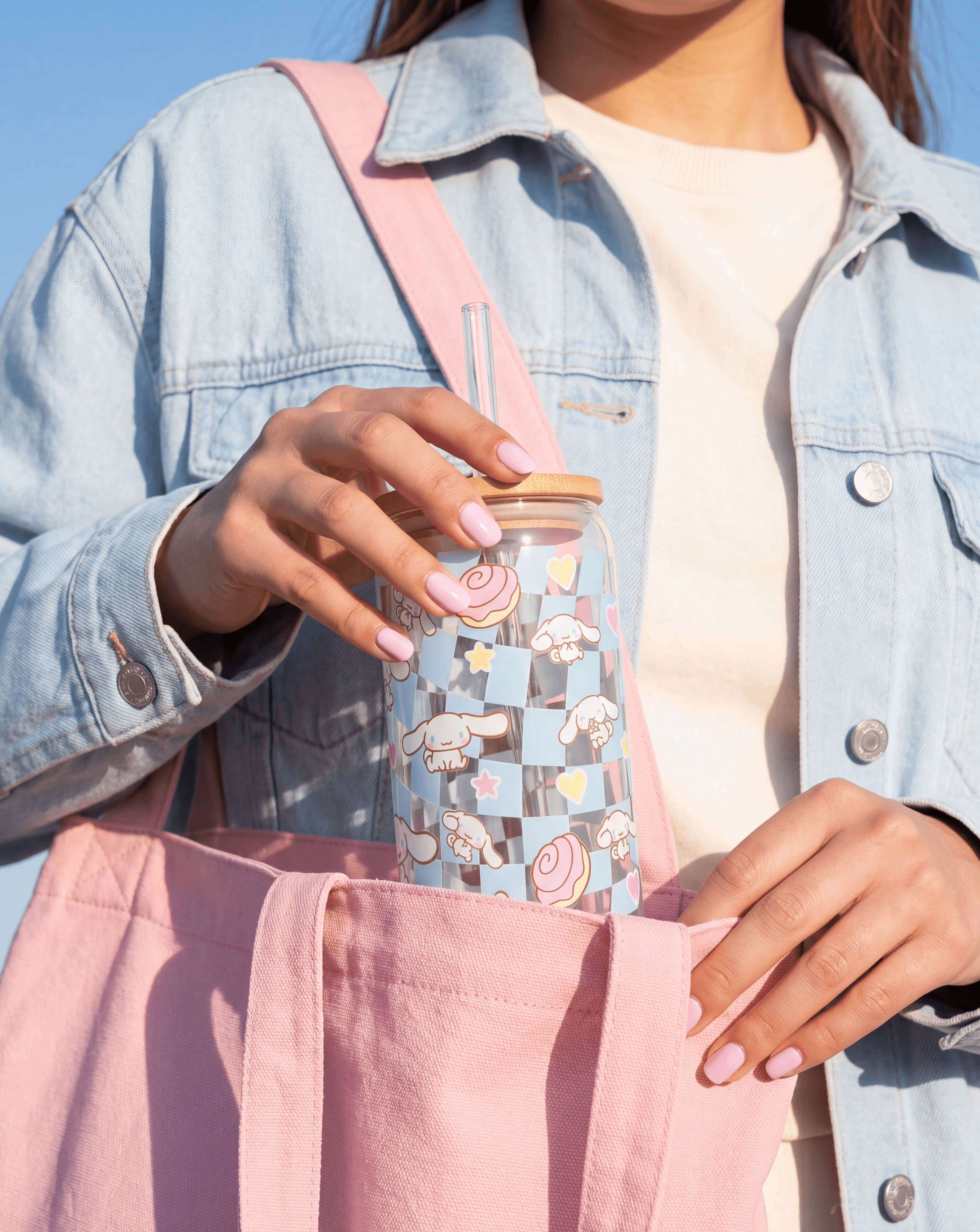
UVibe is a youth lifestyle sub-brand designed as part of my role at Laila’s Candy & Events, it was built around collectible & customisable products, vibrant packaging, and a brand personality that needed to feel fun without losing its edge.
The project included brand identity, packaging, product visuals, and social content, all designed to create a cohesive system that could work across products, market stalls, and digital platforms. The launch pop-up sold close to 10,000 AED in its first three days proof that strong positioning turns a simple product into something people line up for.
UVibe is a youth lifestyle sub-brand designed as part of my role at Laila’s Candy & Events, it was built around collectible & customisable products, vibrant packaging, and a brand personality that needed to feel fun without losing its edge.
The project included brand identity, packaging, product visuals, and social content, all designed to create a cohesive system that could work across products, market stalls, and digital platforms. The launch pop-up sold close to 10,000 AED in its first three days proof that strong positioning turns a simple product into something people line up for.
UVibe is a youth lifestyle sub-brand designed as part of my role at Laila’s Candy & Events, it was built around collectible & customisable products, vibrant packaging, and a brand personality that needed to feel fun without losing its edge.
The project included brand identity, packaging, product visuals, and social content, all designed to create a cohesive system that could work across products, market stalls, and digital platforms. The launch pop-up sold close to 10,000 AED in its first three days proof that strong positioning turns a simple product into something people line up for.
Brand Identity · Packaging · Product Visuals
Social Content · Art Direction
Brand Identity · Packaging Product Visuals · Social Content · Art Direction
The challenge was alignment as much as design. Too playful and the brand would feel childish. Too cool and it would lose the energy that makes it fun.
We built a complete visual identity system, logo, colour palette, packaging, product design, and social content and found the sweet spot both owners could stand behind, one that translates across physical products, market stalls, and social media without losing anything in the process.
The challenge was alignment as much as design. Too playful and the brand would feel childish. Too cool and it would lose the energy that makes it fun.
We built a complete visual identity system, logo, colour palette, packaging, product design, and social content and found the sweet spot both owners could stand behind, one that translates across physical products, market stalls, and social media without losing anything in the process.



Typography with Personality
Typography with Personality
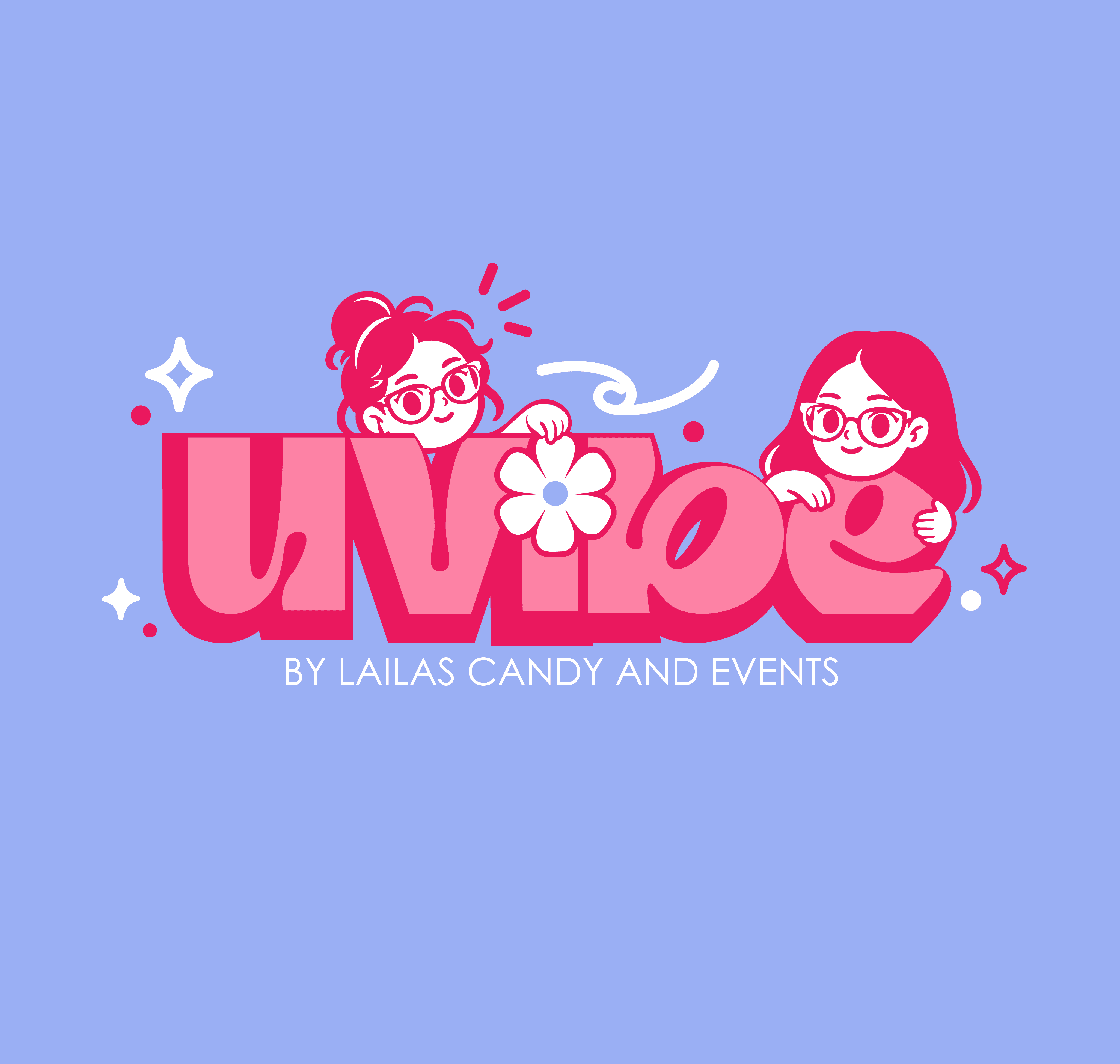
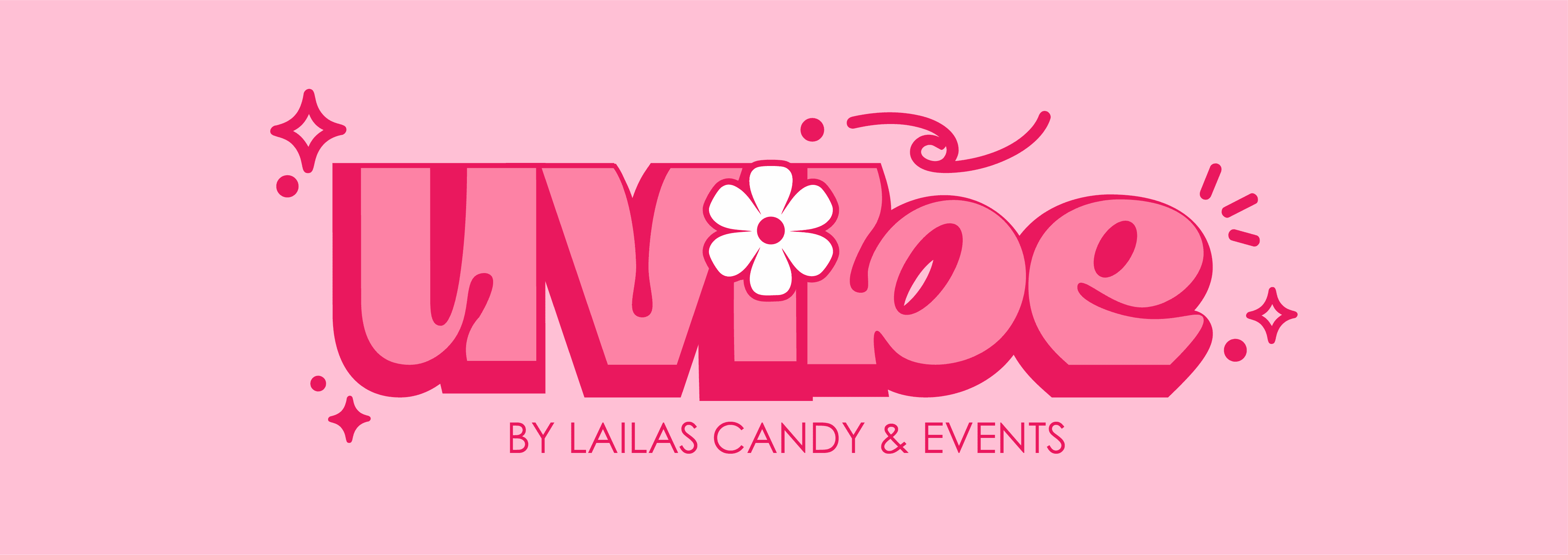
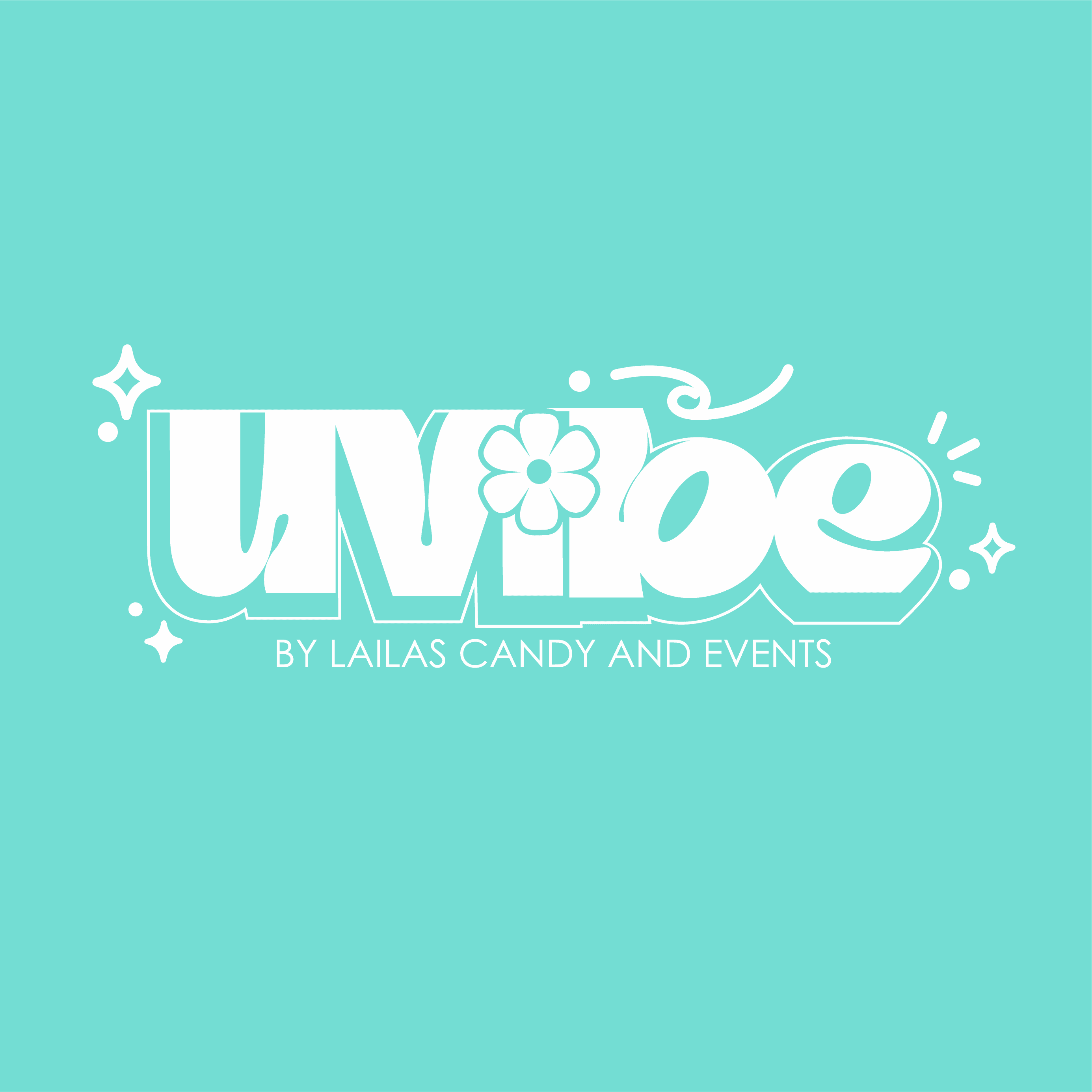
Every detail was considered, including the small ones. The UVibe logo uses a customised typeface with soft curves and expressive lettering. The dot of the 'i' was redesigned into a flower icon at the request of the client's daughters. A small detail that became one of the most recognisable parts of the brand, and a good reminder that the best branding decisions often come from listening, not just designing.
Every detail was considered, including the small ones. The UVibe logo uses a customised typeface with soft curves and expressive lettering. The dot of the 'i' was redesigned into a flower icon at the request of the client's daughters. A small detail that became one of the most recognisable parts of the brand, and a good reminder that the best branding decisions often come from listening, not just designing.


Built for Social-First Storytelling
Built for Social-First Storytelling
A brand that only works on a label is not built for today. UVibe's identity was designed to perform everywhere campaign visuals, animated assets, and social content that make the brand just as recognisable in a feed as it is on a shelf or at a market stall.
A brand that only works on a label is not built for today. UVibe's identity was designed to perform everywhere campaign visuals, animated assets, and social content that make the brand just as recognisable in a feed as it is on a shelf or at a market stall.